Crappy Album Covers #176 — Un-subtle and Cliche

Album_Cover_Crap_322_Supertramp-Crisis-What-Crisi 
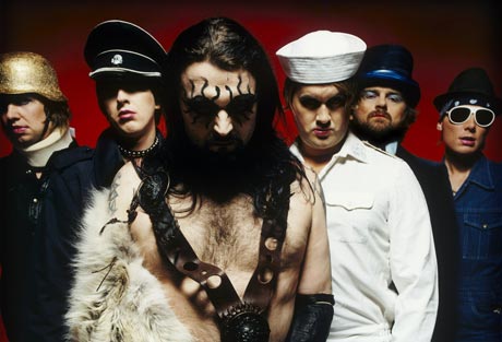
Supertramp could have done better with their fourth album, “Crisis? What Crisis?”, released in 1975. Their artistic skills, which served them so well for songwriting should also be reflected in their choice of album cover. The title and album cover says utterly nothing original, even by 1975 standards.
Album_Cover_Crap_323_Kenny_Loggins 
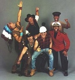
Creator of what O’Donnel and Guterman call “The twin towers of movie theme stupidity ‘Danger Zone’ and ‘Footloose'”, Kenny Loggins leaves no cliche unturned. They forgot a third: “I’m Alright” (Theme from Caddyshack). Alive was released in 1980, and at least, unlike Supertramp, the album cover comes by its cliche qualities honestly, without all that bothersome high literary and musical quality that burdens Supertramp.

Visits: 93

Crappy Album Covers #175 — Thinking you have something important to say

Album_Cover_Crap_217_-_worstalbumcovers_com I guess anyone who ever wondered what had happened to the members of Milli Vanilli after Rob Pilatus (1965-1998) and Fabrice Morvan were outed to being nothing more than two good looking guys lip synching someone else’s music, need wonder no further. By 1990 they went by the name “Rob + Fab”, and had an album out. 

However, the lip-synching allegations followed them to this album also, and sales remained low. No further albums were released by them since. Morvan has released a solo effort in 2003, called Love Revolution, 5 years after the passing of Pilatus, who died in 1998 of a drug overdose.

Album_Cover_Crap_220_-_worstalbumcovers_com Whenever 70s music goes bad, it looks like this. I have no salient info on this group, but I would bet it is from the early 70s. The lettering is bad, the superimposing of the band members on top of a nebula as if crawling out of an acid pool at Yosemite National Park is beyond cliche, beyond amateurish. “You R Us” has a cover that “r” sucky in the extreme. 

Friends, I believe that we now need a new word in the English dictionary to describe a record cover so bad, that you have to work very hard to stoop to this standard. I propose “craptasmagorical” as a possible word. It is easily recognisable what it means, rolls off the tongue well, and is a word that should only be reserved for CACs that go above and beyond the call of duty to look as crappy as possible. “You R Us” is so craptasmagorical, it is actually out of this world.

Visits: 103

Crappy Album Covers #174 — The Return of Monsters!

Album_Cover_Crap_280_rateyourmusic_com_1982 Oh No! It’s monsters, again! Time to run and hide. Judging by this monster with granny glasses, you don’t need to run that fast. This self-titled record was released in 1982, and again in 1983, as an attempt to revive ’70s-style hard rock. were the granny glasses meant to convey a message in that vein?
Album_Cover_Crap_281_stylusmagazine_com Super Furry Animals formed in Cardiff, Wales in 1990. This single, released in 2004 has actually two different covers which I am aware of. The other one is an Elvis lookalike giving a peace sign.SFA is a group with mostly techno roots, who have charted on and off with their various releases.

Visits: 103

Crappy Album Covers #147 — Blunders by Major Acts

Album_Cover_Crap_263_gigwise_com People old enough to remember Abbey Road when it came out engaged in speculation as to why Paul crossed the road barefoot for the album cover.So, I would like to continue the pointless speculation, and begin the discussion as to why Hillel Slovak (1962-1988) refuses to wear a hat. 

However, it’s nice to know that the two guys in the middle like to share their socks among all four members and go barefoot for the good of the band.

Album_Cover_Crap_257_deskgratis_blogspot_com I think they mean “Scandanavian”. Either that or they were playing in “Sockholm”.A CD was released in 1988, but the subtitle “Live In Stockholm” was not added until a 2005 re-release, upon finding the master tapes.In fact, I would speculate that this cover was from 2005, since there is clear evidence of Photoshop at work. The light is coming from the wrong side, and is black and white (seepia, actually), while the light above the mike seems to have arisen from a lens flare effect in Photoshop. Photoshop wasn’t around in 1988. 

The originating concert was broadcast in 1970 for Swedish National Radio.

Visits: 118

Turbonegro vs Village People – Creepy similarities

Turbonegro is a Norwegian punk band. As I understand it, their sub-genre is something called “death-punk”. It has also been called “glam-punk”, and so on. Many aspects of their brand of punk has been influenced by 70s arena rock bands such as Kiss.

I noticed in one of their more recent videos that each of these depressing looking characters plays a different “character”. One is a Hun, another is a military cop, another is a marine deckhand, one is neaderthal, and the other two … well, I don’t know what they are trying to be. But in a less “depressive” form, there is another 6-member group from the era of 70s arena rock that would appear to have similar taste in clothes.

Ah, yes. The Village People. There’s a cop, another navy guy, a biker, a construction worker, a cowboy and an indian. No neanderthals, though. I am not a fan of disco, but at least they are a little less preoccupied with thoughts of death.

Visits: 146