Crappy Album Covers #176 — Un-subtle and Cliche

Album_Cover_Crap_322_Supertramp-Crisis-What-Crisi Supertramp could have done better with their fourth album, “Crisis? What Crisis?”, released in 1975. Their artistic skills, which served them so well for songwriting should also be reflected in their choice of album cover. The title and album cover says utterly nothing original, even by 1975 standards.
Album_Cover_Crap_323_Kenny_Loggins Creator of what O’Donnel and Guterman call “The twin towers of movie theme stupidity ‘Danger Zone’ and ‘Footloose'”, Kenny Loggins leaves no cliche unturned. They forgot a third: “I’m Alright” (Theme from Caddyshack). Alive was released in 1980, and at least, unlike Supertramp, the album cover comes by its cliche qualities honestly, without all that bothersome high literary and musical quality that burdens Supertramp.

Visits: 93

Crappy Album Covers #175 — Thinking you have something important to say

Album_Cover_Crap_217_-_worstalbumcovers_com I guess anyone who ever wondered what had happened to the members of Milli Vanilli after Rob Pilatus (1965-1998) and Fabrice Morvan were outed to being nothing more than two good looking guys lip synching someone else’s music, need wonder no further. By 1990 they went by the name “Rob + Fab”, and had an album out. 

However, the lip-synching allegations followed them to this album also, and sales remained low. No further albums were released by them since. Morvan has released a solo effort in 2003, called Love Revolution, 5 years after the passing of Pilatus, who died in 1998 of a drug overdose.

Album_Cover_Crap_220_-_worstalbumcovers_com Whenever 70s music goes bad, it looks like this. I have no salient info on this group, but I would bet it is from the early 70s. The lettering is bad, the superimposing of the band members on top of a nebula as if crawling out of an acid pool at Yosemite National Park is beyond cliche, beyond amateurish. “You R Us” has a cover that “r” sucky in the extreme. 

Friends, I believe that we now need a new word in the English dictionary to describe a record cover so bad, that you have to work very hard to stoop to this standard. I propose “craptasmagorical” as a possible word. It is easily recognisable what it means, rolls off the tongue well, and is a word that should only be reserved for CACs that go above and beyond the call of duty to look as crappy as possible. “You R Us” is so craptasmagorical, it is actually out of this world.

Visits: 103

[Video] The Politics of Dancing I: The Hambone

This video gallery started as a tribute to those talented enough with rhythm to do The Hambone properly. To see most of the performances on YouTube, it would have appeared to be a pasttime of redneck white Southerners, but this is so far from the case, that I have to conclude that everyone is into it.

In the American South, it’s called The Hambone; in the North, it’s called The Hand Jive; in West Africa where it originated, it’s called The Juba Dance, a relative of the tap dance. It is an art involving lots of clapping, body slapping, and other artfully noisy uses of the hands. The Juba Dance, a dance which involves both hand percussion on the body as well as toe tapping, was brought to The States during the antebellum period where slaves were not allowed to use drums or other instruments for fear it would be used as a method of communication.

But once blacks started doing it, it quickly caught on among whites, where it became known as “The Hambone”. NCAA basketball coach Bo Ryan explains how he learned The Hambone while attending grade school in Philadelphia:

Now throw in some vocal noise and hand farting, and you have a comic act by The Hambone Brothers on the popular ’70s TV show “Hee Haw”, seen here with Roy Clarke:

Steve Hickman throws in some mouth popping and seems to slap himself in the head several times, to the amusement of many giggling children and their parents:

I thought I would save the best for last. Samuel Hicks hails from North Carolina and was just doing the hambone in front of a relative’s video camera in the early 90s. He is so fast, one may be led to believe that those aren’t really hands and more like bionic prosthetic devices:

Next in this series: The Hand Jive

Visits: 133

Crappy Album Covers #47 — I don't get this

album-cover-crap-6_lp-cover-loverDonnie and Joe Emerson’s 1979 offering, Dreamin’ Wild, is classed in some blogs in the psychedelic rock genre.

So, then I if I look at this picture and think that I see two heads growing out of one body, then I suppose that it’s because I am on acid?

If this is not the case, then, is it Donnie fretting the strings on the guitar or is that the hand of Joe? Am I still tripping on acid?

Also, the background of this photo looks like it was rented from the same outfit that shot their high school photos. Soul-Sides.com has found some actual digitized tracks from this album for your listening pleasure.

album-cover-crap-4_lp-cover-lover“Sterling Blythe Sings” is one of those crappy record album covers with crossover appeal. I don’t know whether to say that it fits in as a “crappy cliche checklist” album, or as a “crappy-by-ambiguousness” album. The background for this album cover could also have come from some kind of background used in high school photos.

On the empty cliche checklist:

  • Cowboy hat? Check.
  • Tight pants with rhinestones? Check
  • Cowboy boots with fancy stitching and dye work? Check.
  • Sitting on a … uh….

… and that’s where the ambiguousness comes in. What the heck is he sitting on? A long branch with his legs dangling in the sky? Or a fence (with his legs still having nothing to rest on)? Looks like he could easily topple over and fall down, and that could be the end of his career.  What we do know, and what the artwork appears to show, is that his right heel is off-camera.  So, if that is the case, then he is sitting on a fence with his feet on the ground. With his legs allowed to rest at that angle, the fence can’t be more than 2 feet off the ground, and so the fence can’t be of the type to keep animals (horses, cows, sheep) out, if this were a real farm. In fact for all we know he could be sitting on a fence in a suburban part of Los Angeles or Boston, the only purpose of the fence being to keep the neighbours off his lawn.

Visits: 214

Crappy Album Covers #45 — Teenagers

Teenagers are a difficult demographic to reach, unless you don’t know anything about them. If you know nothing about the demographic, then it does’t pose a difficulty for you. I know that’s kind of like saying that if you don’t know anything about painting a portrait, then slashing the brush in any direction or color at random poses no problem to the painter. It seems that way, with the covers below. If your album overtly suggests that “This album is for teenagers”, I will guarantee you teens won’t buy them. On the other hand, if you say this is “R-rated”, and contains cuss words and sexual suggestions that would put a blush on a two-dollar hooker (you know, like Rap), and that young people shouldn’t buy them at all, then they will fly off the shelves and teens would be the biggest part of the market.

album-cover-crap-19_bizarrerecords_comCase in point, this realistic portrait of teenagers having a good time. I bet you already knew they were listening to this very record, recorded by Bobby Krane and His Orchestra, and distributed by Bravo! Records.

Look! The young lady in the foreground is saying it too! — Bravo! Bravo! At least that looks like what she could be saying.

Look at the photo and indulge in the fantasy that there is still a world where young teen girls don’t dress like sluts; the guys stay straight and sober (by “straight” I meant drug-free, but I guess it could also be taken the other way) and don’t dress like plumber-butt pimps. And the guys even ask the girls “may I have this dance with you?”

And then there’s Tex Ritter. Tex Ritter? And that’s when I woke up.

album-cover-crap-20_bizarrerecords_comThe TOPS record label, which previously warned us about the world ending, are shown here producing records of “12 Top Hits” so you can party like it’s 1999, or more to the point, like it’s 1959.

You have to admit that the one thing that stands out most about this cover is that the lady who is dancing is wearing argyle socks. I thought there was a law passed by Joe McCarthy’s HUAC banning women from wearing argyle socks. It was supposed to be a guy thing. It totally clashes with the pink blouse.  If this is a fashion statement, then she should be arrested by the fashion police for bad fashion grammar.

Once again, the cover consists of the tamest teenagers you’ve never seen. And I don’t think they existed in 1959 either. Even in 1959, teens got drunk, and they had sex. Perhaps the only worthwhile thing that the photo realistically illustrates, is that in 1959, the guys didn’t have the bad taste to wear plumber-butt pants or hoodies, which would have made the chick in argyle look like Elizabeth Taylor (I mean Liz Taylor in 1959, not in 2008).

To anyone born after the 1960s: HUAC = “House Un-American Activities Committee“. It’s sort of like Homeland Security against commies and hippies.

album-cover-crap-18_lp-cover-loverThese seemingly adult-age folks may as well be adolescent, since they are depicted in the way their parents would approve. “I Love Music” was a sampler sent to radio stations across North America from Capitol Records back in 1958. The album cover gives every indication that the HUAC would have approved of this album. Going by the cover, for instance, it is obvious that these two folks are not planning the overthrow of the proletariat, and of taking over the means of production.

The artlessness of these depictions are a sure symptom of the McCarthy era. I recall when I began collecting old issues of Mad Magazine (digested in paperback form) going back to the 1950s, the most boring and least funny issues were during the period of 1958-1963. It couldn’t have been a good time to be a satirist.

And there was one more I forgot to add:
tammy_casual-slack-080726Yes, this 12″ LP of hits, which by the cover seems to treat teenagers as younger than they really are, may not have been headed for any kind of landmark success.

A toy doll with a toy record goes to a toy jukebox to pretend to play music on it. And, what’s left? You can only sing along to the music you are pretending to play.

I must say that much of the advertising I see today parallels the kind of mentality depicted on all of these albums in today’s blog. There is a certain advertising these days that points to a certain clientele, or a certain lifestyle as we would like to see it. But it is made to look artsy, so that you can’t accuse advertisers of appealing to people that don’t really exist. Instead, it can look naive, even idealistically so.  Sticking to album covers, the Putumayo Collection, discussed earlier, is an example of album covers that are like this.

Visits: 137

Crappy Album Covers #31 — Cliches per square inch

As an asside, I would like to know who bought these albums when they were a teenager, then pinned up the album covers on their wall, and threw away the record?

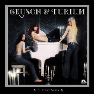
A Gruson & Turium Empty Cliche Checklist:
Topless chicks? Check.
Lit candles? Check.
Ballroom curtains? Check.
Piano to let the buyer know that this is a music album and not something else? Check.
Classy lettering in a colour that matches the piano? Check.
Title that connects in a suggestive way to the photo? Check.

There is no information on Gruson and Turium anywhere that I can find, or on the album “Silk and Satin”.

Candles which are carelessly placed just distrupts my suspension of disbelief. It only looks like they are posing.

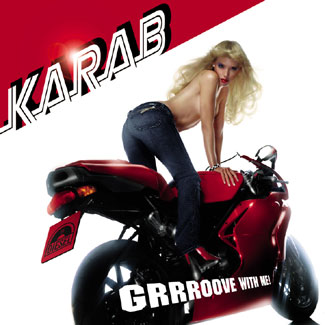
Karab Empty Cliche Checklist:

Topless chick? Check.
Chick has blonde hair? Check.
Chick is wearing tight jeans? Check.
Chick has large gazongas? Check.
Her eye color matches her jeans? Check.
Scabs, wrinkles, bruises, pimples, and body hair airbrushed out of the photo? Check.
Chick is posing on a motorcycle? Check.
Chick is wearing minimum 3″ heels that match the motorcycle color and her lipstick? Check.
Her lipstick color matches her motorcycle? Check.
Her lipstick color matches the license plate? Check.
Font chosen for a “kinetic” feel? Check.
Title has a suggestive connection with the photo? Check.

Visits: 77