Crappy Album Covers #195 — How a CD was made back in the day

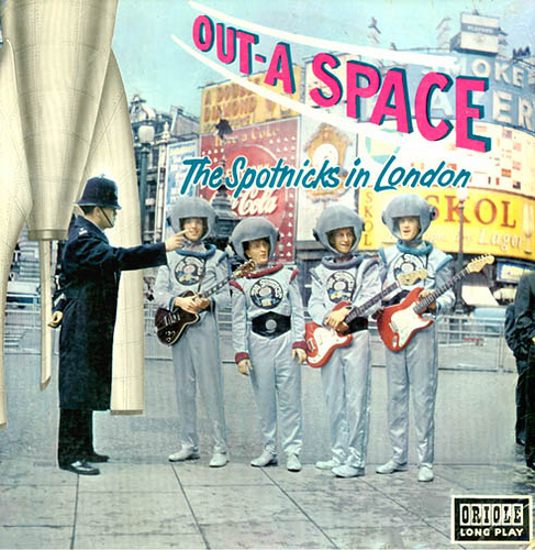
The Swedish group The Spotnicks made this album called Out-A-Space back in 1962. They were among the first really successful Swedish group to exist on the international scene, in the same way that The Ventures and The Shadows did in the late 50s.

Unlike The Ventures, I know of little indication of them making it big across the pond, but they did score many UK hits in their tenure. The space suit gimmick was part of their trademark, and they appeared that way in all their concerts.

Making a CD was hard work, back in the day. You take these metal tongs, clasp the CD in between, then hold them over this shaping tool, then you stick it in the fire until the metal starts to glow and get soft. Then you pit it for the audio tracks with a hammer and chisel.

Uh, a really small hammer and a really small chisel.

Hey, it’s a living.

Croatian MiÅ¡o Kova? was the biggest selling singer from the former Yugoslavia, selling over 20 million records, cassettes, and CDs to date. He had won the Yugoslavian Split Festival 5 times up until 1980, more than any other to that  day. While Wikipedia gives a detailed biography of him, it does not mention this single. Translated, “Za Tvoju Ljubav Sve Bih Dao” appears to mean roughly : “For Your Love I Would Give”. The other side of this single, “Tužno Srce Moje“, translates to roughly: “Sad My Heart”.


Visits: 84
Crappy Album Covers #194 — Cliche Clowns

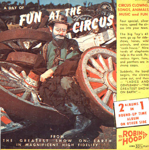
See this clown? Look how much fun he’s had! Fun, fun, fun! So much fun, the entire circus collapsed around him, and now he’s having no more fun. His former employer sold the junk for scrap, and once in a while he comes over to the junk yard to rekindle old memories. Otherwise, he panhandles on a street corner downtown. No more fun! Boo hoo hoo!If they are going to entitle this record “A Day of Fun at the Circus”, then why in the h-e-double sticks was this picture chosen?
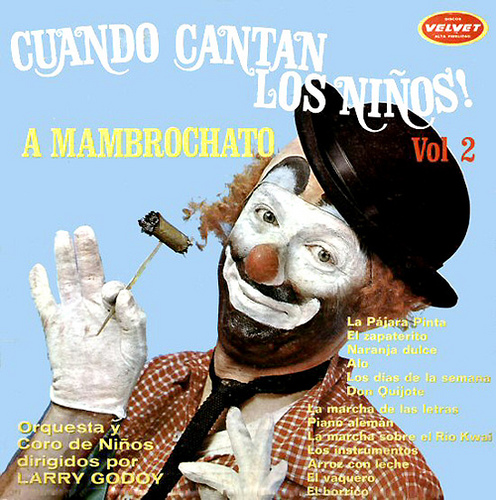
That’s the panhandler from across the street.  At least he bothers to crack a smile, with his album “When The Children Sing” (Cuando Cantan Los Ninos). The ultimate cliche hobo clown, smoking a stogie and looking dapper in his kid gloves, Red Skelton style.No other information was found.

Visits: 95

Crappy Album Covers 193 — Tackiness past and present

Other blogs have already commented on Brooke Hogan’s 2009 CD The Redemption, especially AOL Radio, who has declared this cover the #1 worst of 2009. True, it would look tacky on the side of a van, let alone a CD, but it has a trailer trash groove about it that befits the daughter of Hulk Hogan. 

This being Brooke Ellen Bollea’s second album, she has already made the cover of FHM (anyone surprised?), has had her own reality TV show where her father sometimes appears, and even has her own YouTube account, BrookeStarTV.

I had to rename this graphic so that I could remember that Don Elliott’s album “Music for the Sensational Sixties” was released in the 1950s. 1958, to be exact. Elliott was likely betting that, in two years’ time, they would be driving their Vespas through the Milky Way while listening to 5-time Downbeat award winner Don Elliott and His Orchestra serve some tunes that would go nicely with the space age. Coming at you, Jetson-style, in “Stereo-Spectrum”, whatever that means.

Visits: 50

Crappy Album Covers #181 — Plainness, overdone

plainness, ovedone Currently selling on E-Bay for about 15 bucks, Bobbi Jean White’s album “Higher Ground!” shows Ms White sporting the bouffont she was well-known for.White had been singing gospel since she was a child in Georgia. She had recorded dozens of albums either solo or with other groups, then became a radio announcer beginning for a Gospel radio station in the 1970s. This career extended into the early 90s.She had lost her hearing 12 years ago, and got it back this year through surgery, hearing again at age 79.
Album_Cover_Crap_337 P. J. Orion and the Magnate$’ self-titled LP is diaplayed here, with its litany of cliches, including (1) with the band posing with electrical instruments that could not possibly be plugged into anything; (2) wearing shades; (3) railroad motif; (4) prairie background with requisite blue sky.This was rumored to have been released in the 1960s, while the guys in the photo were attending prep school.

Visits: 132

Crappy Album Covers #180 — The standards and the classics

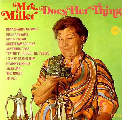
Album_Cover_Crap_331 Elva Miller (1907-1997) made her claim to fame with purposefully bad Ethel Merman imitations where she sung songs from the Great American Songbook out of tune, along with many other kinds of well-known songs.When Mrs. Miller “Does her Thing”, I think the message here is that it is time to run  and hide. You never know what’s in those brownies.
Album_Cover_Crap_324_gyorgy “Hey! Youse guys want to hear some o’ dat long-hair classical music or what? Well, don’t let some schmuck wearing a tux tell you what classical music is; let me tell you. Now, uh, I think my music teacher  told me dat once you hear The Nutcracker, all of the classical music sounds like that. Trouble is, though, my music teacher ran off with my money before I had all my lessons. Dat’s why I dress like a bum. My brudder here got through his lessons, but got killed in an accident with a cabbage truck. We cryogenically froze him in dis position, and so once in a while I take the fiddle from his hand, and fool around with it a bit. Frig it, he’s dead anyway — and I put it back after a while.”

No information exists about Markos and Nadas Gyorgy that I am aware of.

Here is Miss Elva Miller, singing “These Boots Are Made for Walking”. Rather than sounding like Merman, I think that in this song at least, she sounds more like Miss Piggy on the Muppet Show. This is off of her “Greatest Hits” LP:

Visits: 120

Crappy Album Covers #178 — Why they have trouble getting laid

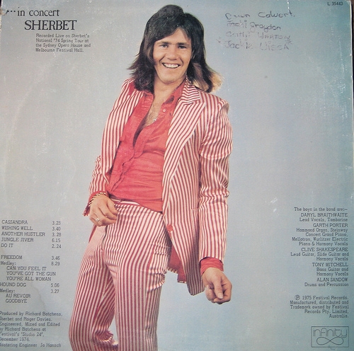
Album_Cover_Crap_325_in_concert_sherbet Red candy stripes on men’s suits was one of those fleeting styles for maybe a month or two in 1975, before someone, somewhere said ‘wtf’, and the style became passe, if it ever was de rigeur.Maybe he really does want to work as a volunteer candy striper at a hospital. I still think he will be in trouble from the head nurse when she tells him to button his shirt. 

That being said, Sherbet was one of the biggest rock bands in Australia in the 1970s, led by (I believe) Daryl Braithwaite and Clive Shakespeare. They have released around 19 Australian top 40 hits in their tenure, with 3 of them reaching #1.

Album_Cover_Crap_326_Jaws Let’s face it. He looks simple, trustworthy (or at least eager to please, in a Gollum kind of a way). The title translates from Portuguese to “Stingray’s Disgusting”, and probably better translated to “Filthy big stingrays” or some such. The subtitle becomes “Animating your party”. 

At another CAC blog (on Flickr, I believe), a caption read “he’s your boyfriend”. It depends on what you want him for, I suppose.

Visits: 124

Crappy Album Covers #177 — Hi, mum!

Album_Cover_Crap_329_Woodruff Little information exists on Mr. Woodruff, so I just have to say that he seems to be too young in the photo to know how he feels. Maybe his English teacher told him for the first time to write about something that made him angry or happy or whatever.Nathan feels like wearing a ruffled shirt with a bowtie today, to go with his 5 O’Clock shadow and mutton chops. Maybe for his next birthday, mum will get Nathan an appointment to get a perscription for contact lenses.
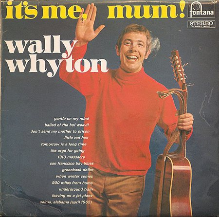
Album_Cover_Crap_340 Wally appears onstage in a packed auditorium, then notices his mother in the audience. She doesn’t expect to see him. She thought she was here to see another guy named Wally Whyton. He finally drops what he’s doing onstage, and waves, looking at her straight in the eye: “It’s Me, Mum!”Wallace Whyton (1929-1997) was not only a musician, but also an announcer for several BBC Radio programs over a 30-year period between 1960 and 1990. He was also active in television, having been a TV host on the Grenada network, as well as appearing on several children’s programs.

Visits: 293

Crappy Album Covers #176 — Un-subtle and Cliche

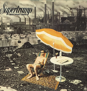
Album_Cover_Crap_322_Supertramp-Crisis-What-Crisi Supertramp could have done better with their fourth album, “Crisis? What Crisis?”, released in 1975. Their artistic skills, which served them so well for songwriting should also be reflected in their choice of album cover. The title and album cover says utterly nothing original, even by 1975 standards.
Album_Cover_Crap_323_Kenny_Loggins Creator of what O’Donnel and Guterman call “The twin towers of movie theme stupidity ‘Danger Zone’ and ‘Footloose'”, Kenny Loggins leaves no cliche unturned. They forgot a third: “I’m Alright” (Theme from Caddyshack). Alive was released in 1980, and at least, unlike Supertramp, the album cover comes by its cliche qualities honestly, without all that bothersome high literary and musical quality that burdens Supertramp.

Visits: 93

Crappy Album Covers #175 — Thinking you have something important to say

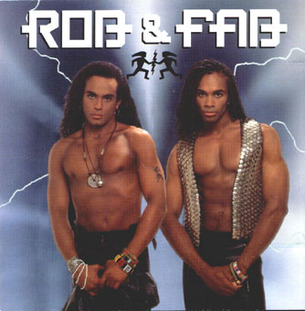
Album_Cover_Crap_217_-_worstalbumcovers_com I guess anyone who ever wondered what had happened to the members of Milli Vanilli after Rob Pilatus (1965-1998) and Fabrice Morvan were outed to being nothing more than two good looking guys lip synching someone else’s music, need wonder no further. By 1990 they went by the name “Rob + Fab”, and had an album out. 

However, the lip-synching allegations followed them to this album also, and sales remained low. No further albums were released by them since. Morvan has released a solo effort in 2003, called Love Revolution, 5 years after the passing of Pilatus, who died in 1998 of a drug overdose.

Album_Cover_Crap_220_-_worstalbumcovers_com Whenever 70s music goes bad, it looks like this. I have no salient info on this group, but I would bet it is from the early 70s. The lettering is bad, the superimposing of the band members on top of a nebula as if crawling out of an acid pool at Yosemite National Park is beyond cliche, beyond amateurish. “You R Us” has a cover that “r” sucky in the extreme. 

Friends, I believe that we now need a new word in the English dictionary to describe a record cover so bad, that you have to work very hard to stoop to this standard. I propose “craptasmagorical” as a possible word. It is easily recognisable what it means, rolls off the tongue well, and is a word that should only be reserved for CACs that go above and beyond the call of duty to look as crappy as possible. “You R Us” is so craptasmagorical, it is actually out of this world.

Visits: 103

Crappy Album Covers #174 — The Return of Monsters!

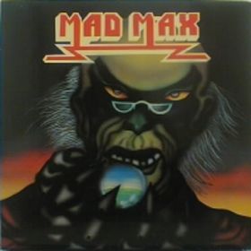
Album_Cover_Crap_280_rateyourmusic_com_1982 Oh No! It’s monsters, again! Time to run and hide. Judging by this monster with granny glasses, you don’t need to run that fast. This self-titled record was released in 1982, and again in 1983, as an attempt to revive ’70s-style hard rock. were the granny glasses meant to convey a message in that vein?
Album_Cover_Crap_281_stylusmagazine_com Super Furry Animals formed in Cardiff, Wales in 1990. This single, released in 2004 has actually two different covers which I am aware of. The other one is an Elvis lookalike giving a peace sign.SFA is a group with mostly techno roots, who have charted on and off with their various releases.

Visits: 103

Crappy Album Covers #173 — Genre confusion

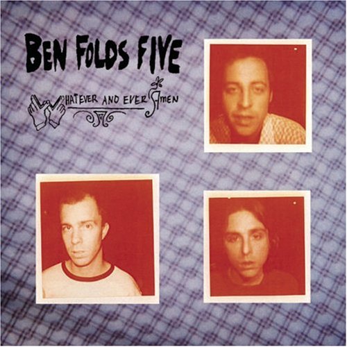
Album_Cover_Crap_287_musicforants_com This is the second album released by The Ben Folds Five, called “Whatever and Ever, Amen” released in 1997, and remastered in 2005.

The combination of seepia photos of the band members against a tablecloth background is unbecoming of an alternative record. Maybe a Johnny Cash album, if he was still alive. Or for that matter, Porter Wagoner. There is also the problem of The Ben Folds Five consisting of only three members.

The alternative “attitude” lies solely in the strength of the title.

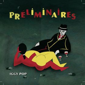
Album_Cover_Crap_292_wikipedia_org This is one of those album covers that make you think that Mr. Pop should go back to mutilating himself and throwing himself into the audience, along with his other “neurosis-as-theatre” antics. Released just over four months ago, Preliminaires leans heavily toward New Orleans-style jazz with a toned-down rock edge.

Hear him sing songs taken from Louis Armstrong, Jelly-Roll Morton, and Edith Piaf. Quite the departure from The Stooges.

Visits: 100

Crappy Album Covers #172 — Scary warlike thingies

Album_Cover_Crap_315_inspiredology_com Let’s get something stright here. Just because there are scary warlike thingies on your album like the Transformer dude on this Linkin Park record, doesn’t mean it’s a cool record, OK? It might impress a 10 year-old, but not many older people.
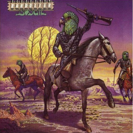
Album_Cover_Crap_298_guardian_co_uk Bodies of men with heads of birds as a warlike thingie has been overdone to the point where it has lost its power to scare people, if it ever had it at all. 

There are many scary birds: hawks, eagles, but since the name of this band is called Budgie, well… three guesses as to what species these heads belong to.

Bandolier is Budgie’s fifth album, released in 1975, and combines all the worst elements of the early Yes album covers.

Visits: 105

Crappy Album Covers #170 — Unhealthy lifestyles

Album_Cover_Crap_285_musicforants_com_mew-and-the-glass-handed-kites The idea of heads being depicted as eating other heads on this “Mew” album, as an attempt to look disturbing, fails miserably and just becomes another Photoshop hack job.

However, Mew’s CD released some time around 2007 is reputed to be a decent album content-wise.

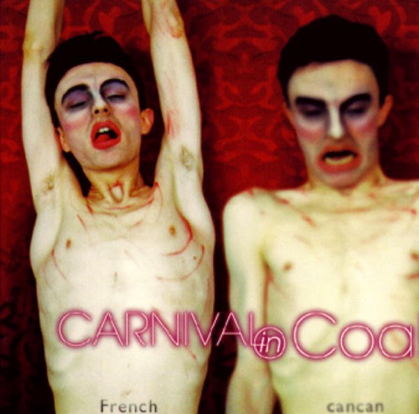
Album_Cover_Crap_309_progulus_com Carnival in Coal was a French Death Metal band that had been together for 12 years from 1995 to 2007. For those keeping track, they mixed many avant-garde genres, but all releated to death metal.

Maybe they were tired of walking out on stage like corpses. Corpses with lipstick and mascara.

Bunk Strutts has requested at least a video, a link, something that might add another dimension to these people. I was looking at “Carnival in Coal”, and passed over titles like “Shemale Whoregasm”, and “Fuckable (live in Paris)”. Instead, I have them doing “Don’t be Happy, Worry”, a new take on an old Bobby McFerrin tune. (no longer available)

Visits: 83

Crappy Album Covers #169 — Bad Steely Dan Covers

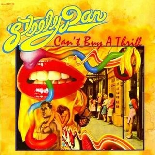
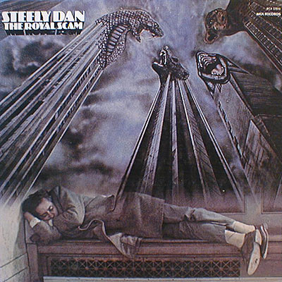
Album_Cover_Crap_288_rateyourmusic_com You are looking at the two albums once rated by band members Walter Becker and Donald Fagen as being the two worst album covers of the seventies, bar none, according to Wikipedia. 

I disagree. I think I could come up with several seventies’ past postings that could be worse than this.

I grew up with this kind of music. I never knew what Steely Dan were about. Did anyone? Becker and Fagen never seemed to be quite sure either, in trying to define their style, which only had tenuous points of contact to rock. For this, they risked having the cover artist also unable to pictorally define their style. There is too much going on in the artwork to make heads or tails of it.

“Can’t Buy a Thrill” was their first LP, released in 1972, sounds more bluesy and jazzy than anything. It was a big album for them, having yielded their two signature tunes: “Reeling in the Years”, and “Do It Again”.

Album_Cover_Crap_289_rateyourmusic_com … And from “The Royal Scam”, “Kid Charlemagne” could arguably be another signature tune. 

A homeless dude asleep on a bench underneath images of mutating skyscrapers? I dunno. Doesn’t work for me, although it is supposedly an artistic attempt to shatter the Horatio Alger myth, that if everyone works hard enough, that one day everyone can own their own skyscraper (or something like that). And the imagery is of the hit-you-over-the-head-with-a-shovel variety.

Visits: 188

Crappy Album Covers #167 — Negative Brand Recognition II

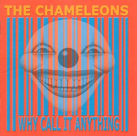
Album_Cover_Crap_279_rateyourmusic_com_2001 This is the Manchester-based group, The Chameleons, with their 2001 CD “Why Call It Anything” with the world’s biggest UPC symbol to bugger up scanners all over the world. Behind that is some kind of dorky, clowny smiley thingy with too many teeth but excellent bridgework. 

What galls me is that the band, or some human, … somewhere, had to approve this album cover before it got released. It could have all been prevented, but I would say now that all those involved are covering their tracks, now.

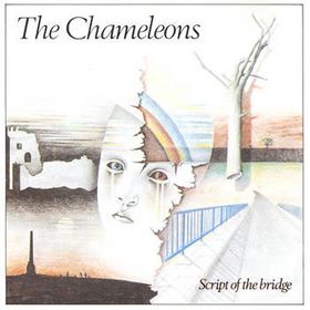
Album_Cover_Crap_278_rateyourmusic_com_1983 “Script of the Bridge” their first album. A nice pencil crayon design that their Grade 12 art teacher would approve of. 

I have this album, and have owned a copy since at least 1984. The contents of this album are very good, and it was re-released last year with an additional bonus CD.

Visits: 75

Crappy Album Covers #166 — Negative Brand Recognition I: Weezer

Album_Cover_Crap_282_thealmightyguru_com_WeezerBlue Uh, yeah, like, we’re members of this band “Weezer”, and, uh, like, buy our record OK?

Weezer is a band that may, on some level, be authentic and earthy (in the grunge sense); but with these album covers, they just look like some guys that just came out of Starbucks to pose for a cover before going back to their lattes.

This is thier first album, self-titled (or to re-use an old joke, maybe they didn’t title it themselves).

Album_Cover_Crap_283_thealmightyguru_com The Beatles had their songs on albums referred to as “The Red Album” and “The Blue Album”, so why can’t Weezer? This is their third self-titled album, referred to as “the Red Album”, released in 2008. No matter how they dress, they still look like they are about to trot back to Starbucks to order their biscottis and doppio macchiatoes in the best fake Italian they can.

The picture-of-band-members-on-a-primary-colour-background aesthetic has, I believe, run its course, Weezer. Consider that artistic avenue explored, and move on. Please.

Visits: 80

Crappy Album Covers #165 — Just Hanging Around

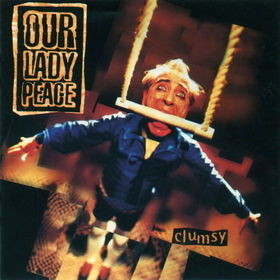
Album_Cover_Crap_275_rateyourmusic_com This is the second CD released by the Toronto-based group Our Lady Peace. The cover features septuagenarian model Saul Fox, a frequent flier on many of OLP’s album covers. A combination of bad lighting and bad retouching makes it pretty clear that he is standing on the floor, giving little cause for the fear and tension in Fox’s expression. There should have been more effort made to produce the illusion of being airborne. And Fox ought to lose the mascara.

Considering that Canada has roughly the same population as California, selling one million albums in Canada alone is a rare achievement, and is awarded diamond status. OLP’s album Clumsy went diamond in 1997.

In the United States, Diamond is awarded by the RIAA for sales in excess of 10 million.

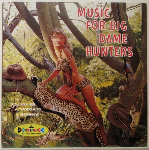
Album_Cover_Crap_265_funkyjunktrunk_com This lady likes to hang around too, although she looks more relaxed, and besides, she seems to have bagged a couple of hunters for herself. And while she doesn’t look like a “big dame”, I am sure most guys won’t mind her size at all. My only fear is that she might end up on some guy’s mantle as a trophy woman.

This is put out by “Sounds of A Thousand Strings”, although there are many blogs and sites selling used/reissued copies of this LP that claim it is by Art Neville, the New Orleans-based studio musician. Not much other reliable information seems to exist, such as what year this album was made. I am getting years in the 1980s and 1990s, likely the year of reissue. However, the depiction of late Nebraskan model/actress Irish McCalla (1928-2002) places this LP solidly in the mid-1950s.


Visits: 83

(Adult Content) Crappy Album Covers #164 — How they do it

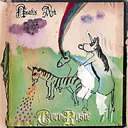
Album_Cover_Crap_300_guardian_co_uk This is a 2005 album by Coco Rosie called “Noah’s Ark”. We see unicorns having a threesome over here (a slight departure from Genesis). My impression was that this album was some kind of progressive/heavy metal/grunge/experimental album. However, this is far from the case. Coco Rosie plays folk. Freak folk, to cite Wikipedia.Coco Rosie is a French-based female duo Bianca “Coco” Leilani and Sierra Rose “Rosie” Casady.
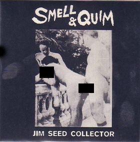
Album_Cover_Crap_291_rateyourmusic_com_cooked I put the black bars there myself, and consider it an improvement. The band name and title say it all anyway, doesn’t it? Their oeuvre deals mainly with taboo and edgy subjects ranging from drug addiction to necrophilia. Their approach is rarely serious; mostly absurdist. “Jim Seed Collector” is the name of a seven-inch single, released some time back.Smell & Quim are a British experimental group, performing in England as late as 2007.

Visits: 86

Crappy Album Covers #163 — Lacking a Certain "Je ne sais quoi"

Album_Cover_Crap_200_musicforants_com In a failed attempt to “Out-4AD” the album designs of other groups signed to that label, The Mountain Goats approved this supposedly muted-but-proggy album design. 

You place a cartoony stock image of a boxer painting on top of a splattery concrete background that the Cocteau Twins probably rejected, then place the album and band name somewhere on the cover, and ya gotchyerself a 4AD album all your own. Easy as pie.

Their 2006 album “Get Lonely” was their 15th to be released, but their fifth album on 4AD. It reached #193 on Billboard’s Top 200 that year.

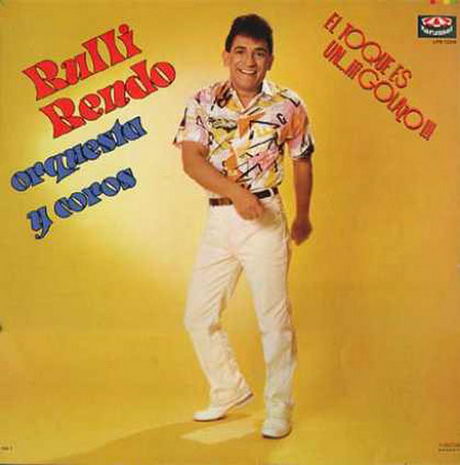
Album_Cover_Crap_202_uncoached_com There is little information on Rulli Rendo’s Orchestra and Chorus. But for those interested, he has a very current website. He has been over 40 years in the music business, and has lived most of his life in Mexico. He currently is residing in Peru, his native country.

Visits: 190

Crappy Album Covers #162 — Tribal Suckiness

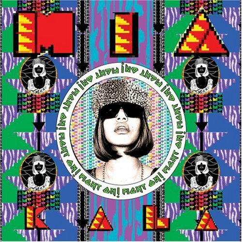
Album_Cover_Crap_201_musicforants_com This 2007 album by M. I. A. called “Kala”. It may have hit Billboard’s Hot 200 at #13, but the album by London-born Mathangi Arulpragasam won some kind of informal tastelessness award from crappy album cover blogs across the ‘net. 

Could it have something to do with the color scheme? Or how ’bout the four — count ’em — four negative shots of Ms Arulpragasam with that whatchamacallit on her head? Or could it be the Inca-like design theme for a cover from someone whose ethnicity is actually Sri Lankan? All of the above, I think.

Album_Cover_Crap_317_inspiredology_com Tongues are wagging across the crappy album blogosphere, as to whether the band name is “Tool” or “Fool”? The choice of font for their 2006 #1-charting and Platinum-selling album makes this challenging. 

The name of this California-based band is actually “Tool”. Their Grammy-award winning CD also has this ambiguous triablesque design. The number “10,000” has a distinct name in Greek, which tranlates to “myriad”. I have no idea if it connects with the album in any way.

The contents may be great, but the cover is awful and if anything it ends up emphasising a lack of any connection to anything tribal. As with both albums, any attempt to connect with anything of a tribal nature using bad art simply defeats its own object.

Visits: 84